
Headshot Backgrounds in 2026: Colour, Depth and Settings That Look Professional
A practical guide to headshot backgrounds in 2026: why separation matters more than the wall itself, grey versus white versus black, coloured backdrops and brand colours, turning a room into a studio, adding depth without clutter, seamless paper, outdoor settings, office shots, virtual backgrounds, lighting the backdrop and the mistakes that make a photo look amateur.

ON THIS PAGE
A headshot is a photograph of a face in front of something. Most advice concentrates on the face, and almost none of it on the something, which is strange, because the background occupies roughly half the frame and sets the tonal range that the face has to work within.
The background has exactly one job. It should make the face the brightest, sharpest and most detailed thing in the image. Every choice below - colour, tone, distance, texture, blur - is a way of doing that job well or badly.
This guide covers the whole range: studio paper and painted walls, the greys that professional photographers default to, coloured and brand backdrops, ordinary rooms, outdoor settings, offices, virtual backgrounds, and the specific constraints that come with generating a portrait rather than taking one.
If you are still deciding what to wear, what to wear for a headshot covers tone and texture in the garment, which has to be chosen together with the background tone. If you are taking the photo yourself, how to take good pictures of yourself with a phone covers the camera side.
#The Short Answer
| Background | Best for | Watch out for |
|---|---|---|
| Mid-grey seamless paper | Almost everything, corporate and creative | Can look anonymous if the light is flat |
| White or off-white | Bright modern brands, editorial and product-adjacent work | Clips easily, merges with pale clothing and skin |
| Black or charcoal | Premium, theatrical, speaker and author photos | Swallows dark hair and needs a rim light |
| Coloured backdrop | Brand consistency across a team page | Colour casts onto the face and dates the image |
| Plain painted wall at home | Anyone with a wall and a window | Sockets, corners, picture hooks and body shadows |
| Textured wall, brick or stone | Warmer, character-driven portraits | Texture competes with the face if it is sharp |
| Soft foliage outdoors | Approachable personal and dating photos | Sun, bright sky and busy detail behind the head |
| Office or workplace | Illustrating a role rather than a person | Depth of field is hard to control and clutter multiplies |
| Virtual or generated | Quick video call backgrounds | Visible cutout edges in a still photograph |
| Blurred anything | Any of the above, when detail is a problem | Over-blurring looks like a filter, not a lens |
The rest of this article explains each row and the situations where the safe answer is wrong.
#Why Separation Matters More Than the Wall
#The eye looks for the brightest thing
A photograph is read in order of contrast. The viewer's eye goes to the brightest, sharpest, highest-contrast area first, and only then to the rest. In a good headshot that area is the face. In a bad one it is a window, a white wall, a bright lamp or a doorway.
This is the whole principle behind background choice. You are not decorating a space, you are deciding where the eye lands. The face does not have to be dramatic or brightly lit in absolute terms; it only has to be clearly brighter and sharper than everything around it.
#Tonal separation, not contrast for its own sake
Separation means a difference in tone between the subject and the background. It does not mean maximum contrast. A dark suit against a black background has plenty of contrast in theory and none in practice, because both ends are crushed together.
The reliable approach is a step of about two stops: light subject on a darker background, or dark subject on a lighter background. What matters is that the silhouette of the head and shoulders stays readable, including the hair.
Hair is the test case. If you cannot tell where the hair ends and the background begins, the separation has failed, whatever the rest of the frame looks like. This is why photographers light a dark-haired subject against a light background differently from a blonde subject against the same background.
#The background sets the tonal range
A camera has a limited range between the darkest and brightest thing it can record. The background occupies a large area of the frame, so it takes up a large share of that range.
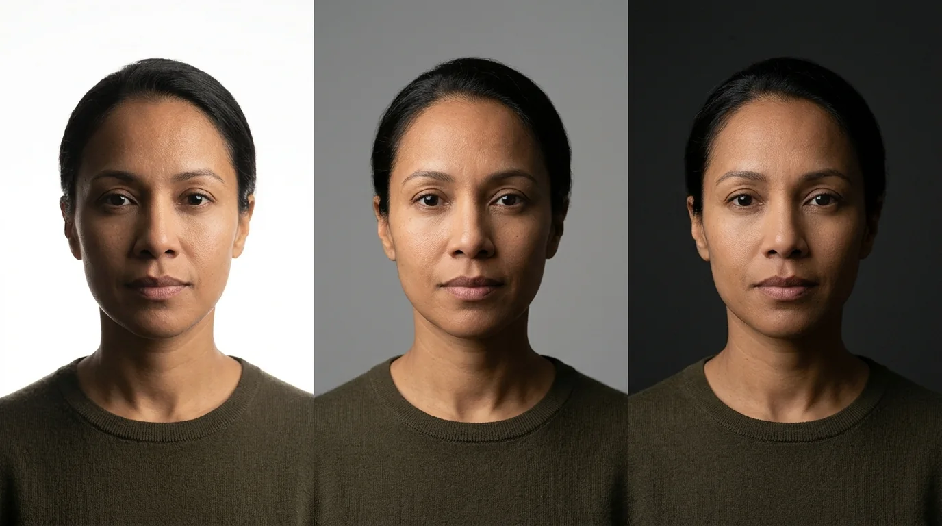
A bright white background pushes the exposure down and leaves less room for highlights on the face. A black background absorbs light and leaves less room for detail in shadows, so the shadow side of the face becomes a flat mass. A mid-grey background sits in the middle and gives the face room in both directions.
That is the mechanical reason grey is the professional default, and it has nothing to do with taste.
#What the background should never do
- Be brighter than the face.
- Be sharper or more detailed than the face.
- Contain text, logos or a recognisable face.
- Introduce a strong colour that reflects onto the skin.
- Show a horizontal line that cuts the neck or the shoulders.
#Grey, White or Black
#Mid-grey: the default for a reason
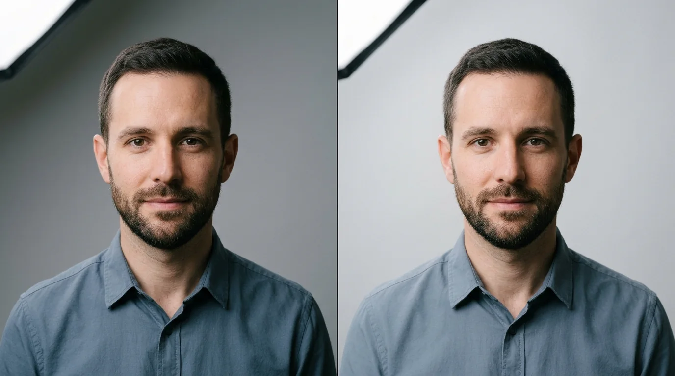
Grey is the most common professional background because it is the most forgiving. It separates from almost every garment and every skin tone, it holds detail when lit, it does not cast colour onto the face, and it survives being displayed as a small circle.
Two greys are worth knowing. A warm grey, with a little brown or yellow in it, sits comfortably with warm skin and warm clothing. A cool grey, with a little blue, suits cool skin and cool palettes. A neutral grey is a compromise that works with everything and flatters nothing in particular.
A gradient grey - lighter on one side, darker on the other - is the studio standard, because it adds depth without adding objects. It is produced by lighting one side of the backdrop more than the other, not by a special material.
#White: bright, modern, unforgiving
A white background reads as clean, current and product-like. It is the right choice for a brand that is light and modern, and for photos that will sit next to e-commerce imagery.
It is also the hardest to do well. White clips easily, so the auto-exposure protects the wall and drops the face into shadow. It merges with pale clothing and with light skin, so the shoulders and even the neck can lose their edge. And it needs its own light source, because a white wall lit only by spill from the subject is grey in the photograph.
If you want white, aim for off-white or a very light grey in the final image rather than pure 255 white, and make sure the clothing is clearly darker than the wall.
#Black: dramatic and difficult
A black background looks premium, theatrical and confident. It is the classic choice for speaker photos, author portraits and anything that wants a little gravitas.
It fails in two specific ways. Dark hair disappears into it, so the head loses its outline. And the shadow side of the face merges into the background, so the face looks half-width. Both are solved with a rim light - a small light behind and to one side of the subject that draws a thin bright edge along the hair and shoulder - but that is a second light, and most people at home do not have one.
If you cannot add a rim light, choose charcoal rather than black, and put a slightly lighter tone behind the shoulders if the frame allows it.
#How to choose between them
Three questions, in order:
- What will the photo sit next to? A team page full of grey backgrounds wants grey. A personal brand built on white wants white.
- What is your hair and clothing tone? Dark hair and dark clothes need a lighter wall. Pale hair and pale clothes need a darker one.
- Do you have a second light? If not, grey is the answer regardless of preference.
#Coloured Backdrops and Brand Colours
#When colour helps
A coloured backdrop is a branding decision before it is a photographic one. It makes a set of team photos look deliberate, it ties a headshot to a website palette, and it can carry a mood that grey cannot.
It works when the colour is deep and desaturated rather than bright. Forest green, petrol blue, deep burgundy, slate, warm rust and muted mustard all photograph well because they hold detail and do not reflect much colour onto the skin. Bright primary colours do the opposite: they bounce light onto the face and tint the shadow side of the jaw.
#The colour cast problem
Every surface reflects light. A large green wall next to a face throws a faint green light onto the shadow side of that face, and a camera's automatic white balance cannot correct it because the lit side of the face is neutral.
The practical fix is distance and darkness. A deeper, less reflective colour casts less. Moving the subject further from the backdrop helps. And if you are lighting the backdrop separately, keep that light low, so the wall does not become a large secondary light source.
#Matching a brand palette
If you are photographing a team, pick the colour from the brand palette that is darkest and least saturated. Save the bright accent colours for graphic elements, not for the wall behind people's heads. Two or three tones from the same family - a deep teal, a slate and a warm grey - give variety across a team page without making it look like a colour swatch.
#Colours to avoid
- Bright red, which clips on the red channel, makes skin look flushed beside it and reads as an alert.
- Neon and fluorescent tones, which are outside what most cameras reproduce accurately.
- Colours close to the subject's skin tone, which flatten the silhouette.
- Colours close to the clothing, which defeats the purpose of a backdrop.
- Trend colours, which date the photograph within a year or two.
#Turning a Room Into a Studio
#Find the wall, then check the light
The best wall in a house is usually the one with the most space in front of it and the least light falling on it. You want a surface that can go slightly darker than the face, and you want to be able to stand two metres away from it.
Stand where you plan to photograph, hold up a phone in selfie mode, and look at the wall in the frame. What you are checking for is not beauty but absence: no sockets, no picture hooks, no corners, no light switch, no visible shadow of your own body.
#Deal with the corner problem
A corner creates a vertical line that reads as an accident, and a ceiling line creates a horizontal one that cuts across the top of the frame. The simplest fix is to stand closer to the wall on one side and turn slightly so the frame falls entirely on the flat part of the surface.
If the wall is too short, a large sheet of white or grey paper taped to it extends the flat area upward and costs almost nothing.
#Kill the body shadow
The shadow behind your shoulder is the most common amateur tell in a home headshot. It appears because a light in front of you throws your shape onto a wall directly behind you, and it is worst when you are standing close to that wall.
Two fixes, both simple: move further from the wall, or move the light further to the side so the shadow falls out of the frame rather than directly behind you. A shadow that falls off to one edge can even help, because it adds gradient.
#Curtains, sheets and improvisation
A heavy curtain in a solid colour is an excellent backdrop: it absorbs light, it is wide, and it is matte. A bedsheet works if it is ironed and stretched tight, but folds read as texture and texture competes with a face. A large sheet of mounting board or foam board behind the shoulders can neutralise a busy wall in a tight crop.
None of these need to look like a studio. They need to look like nothing.
#What a real backdrop adds
A proper paper or fabric backdrop adds three things: width, so the frame never shows a corner; a consistent surface with no architectural quirks; and the ability to be lit separately from the subject.
If you photograph headshots more than once a year, a paper roll and a simple stand are the cheapest upgrade available. If you are doing it once, a wall and a window are enough.

#Depth Without Clutter
#Why depth helps
A perfectly flat wall looks like a passport photo. A background with a little depth - something slightly behind and to one side, softly out of focus - looks like a place, and it separates the subject from the surface in a way the eye finds comfortable.
The depth has to sit behind the subject, not beside them. A plant next to a shoulder competes with the face; the same plant two metres back reads as texture and colour.
#Distance does the work
Background blur is mostly a function of distance, not of aperture. Moving from half a metre away from a wall to three metres changes the background more than opening the aperture by two stops.
The practical sequence for a home photo: stand about one to one and a half metres from the camera, and put the background at least two metres behind you. That combination makes the wall soft without making it invisible, which is the look most professional headshots have.
#What counts as good detail
Good background detail is quiet. A plant, a curtain edge, a section of wall with a gentle gradient, a bookshelf far enough back to be a texture rather than a list of titles. Bad detail is anything the viewer can name: a specific book, a specific photograph, a specific brand.
A useful test: blur your eyes or step back from the screen. If the background becomes a soft pattern, it is working. If you can still identify objects, it is competing.
#The over-blur problem
Digital blur applied afterwards, or a portrait mode that fails, produces an edge that does not match a real lens: hair becomes a halo, glasses frames disappear, and the boundary between subject and background looks cut rather than focused.
Real optical blur has a gradual falloff, and it keeps highlights as soft discs rather than erasing them. If you can achieve blur with distance, do that instead.

#Outdoor and Office Backgrounds
#Outdoor: what works
An outdoor headshot works when the background is soft, secondary and unchanging. Foliage at a distance, a plain brick or stone wall, a smooth concrete surface, a hedge, a shaded courtyard.
Overcast light is the outdoor photographer's best friend, because it fills shadows under the eyes and does not put a hard line across the face. If the sun is out, find open shade - the shadow of a building, not the dappled shadow of a tree.
#Outdoor: what fails
- A bright sky behind the head, which pushes the face into silhouette.
- Strong colour behind the head, such as a red awning or a green hedge in direct sun.
- Moving elements: traffic, pedestrians, flags, water.
- Depth of field that is too shallow, so the background becomes an unrecognisable blur rather than a place.
- Dappled light, which puts random bright patches across the face and never looks intentional.
#Office and workplace
An office background is useful when the photo is illustrating a role rather than a person: a workshop, a laboratory, a kitchen, a studio. It stops being useful when the viewer starts reading the background instead of looking at the face.
Three controls make an office shot work. Shoot along the longest diagonal of the room rather than into a corner. Use a longer lens or a wider aperture so the room falls soft. And clear a zone immediately behind the subject of a metre or two, so the nearest objects are out of focus and the far wall provides the tone.
Screens are the specific hazard of office photographs: a monitor showing content is text, text is detail, and detail behind the head pulls the eye. Turn screens off or angle them away.
#Consistency across a set
If several people are photographed in the same workplace, keep the background tone and the light direction identical. Variation should come from faces, not from walls. This is the difference between a team page and a collection of unrelated portraits.
#Virtual, Generated and AI Backgrounds
#Virtual backgrounds in a still photo
A virtual background replaces the room behind you in real time. In a video call that is fine, because the image is soft, moving and small. In a still photograph the same technology is visible: the cutout edge around hair and glasses, the mismatch between the light on your face and the implied light of the new scene, and the unnaturally uniform sharpness of a background that should fall out of focus.
This is why a virtual background almost always reads as a composite in a headshot, even when it is well made.
#When a generated background works
A generated or painted backdrop can work when it is deliberately plain: a soft gradient, a single colour, a subtle studio falloff. That is not because the technology is good, but because a plain background has nothing that can be wrong.
The failure comes from scenery: an office, a city skyline, a library. Scenery implies a light direction that will not match yours, and it implies depth that will not match your focus.
#What an AI headshot needs from its input
If you are generating a set of portraits rather than taking one, the background in your source photos matters more than it does in a normal photo, because the model has to reproduce it consistently across every frame.
Three requirements:
- Plain. No objects, no text, no furniture edges. Every element is something the model can redraw differently between frames.
- Evenly lit. A background with a strong gradient in the input can become an inconsistent gradient in the output.
- Slightly out of focus. A soft background gives the generated image a clean edge around the hair, which is the hardest part of any generated portrait.
Mid-grey, off-white and soft slate are the safest inputs. A busy bookshelf is the worst, because the model has to invent the books twice.
#What the model gets wrong
- Hard edges in the input become halos around the hair in the output.
- Text in the background becomes nonsense text, which is immediately recognisable.
- Strong colours in the background can bleed into the skin tone.
- Different backgrounds across input photos can produce a set where each image looks like a different room.
If a generated set looks inconsistent, the cheapest fix is usually to reshoot the inputs against a plain wall rather than to retouch the output.
#Lighting the Backdrop
#Light the face first, then the wall
The most common mistake in home setups is trying to light both at once with one source. The face needs a soft light close to it, at about 45 degrees. A background lit only by spill becomes flat and grey.
If you want the wall brighter, you need a second light aimed at it, and that light should not hit the subject. If you want the wall darker, do the opposite: keep the source close to the face and away from the wall, so the background falls off naturally.
#The inverse square rule, practically
Light intensity drops quickly with distance. That is why a source close to the subject lights the face much more than the wall two metres behind, and why a source far away lights both almost equally.
In practice: bring the light closer to the face to make the background darker, and move it further away to make the background brighter and flatter. This is the single most useful lever you have, and it costs nothing.
#A rim light, if you have a second source
For a dark background or dark hair, a small light placed behind and to one side of the subject draws a thin bright edge along the hair and shoulder. That edge is what stops a black background from swallowing the head.
A phone torch, a small LED panel or even a lamp with a diffuser works. Keep it dim: the rim should be a line, not a glow.
#Short lighting and the shadow side
Turning the subject slightly away from the key light puts more of the face in shadow. That is flattering for most faces, but it only works if the background behind the shadow side is lighter, so the shadow has an edge to read against.
This is the practical reason a gradient backdrop is useful: you can place the lighter part behind the shadowed cheek and the darker part behind the lit cheek, and the face gains shape without any extra equipment.
#Common Mistakes
The ten failures that show up most often, roughly in order of how much they cost:
- Standing against the wall. The body shadow appears behind the shoulder and the background is sharp. Move two metres forward.
- A background brighter than the face. A window, a white wall or a lamp behind the head. The face becomes a silhouette.
- Text or a screen in frame. A monitor, a poster, a book spine. Any legible detail pulls the eye.
- Same tone as the clothing. The shoulders merge into the wall and the crop looks unfinished.
- Same tone as the hair. Dark hair on a dark wall, pale hair on a pale wall. The head loses its outline.
- A visible corner or ceiling line. It reads as an accident, not a composition.
- Clutter at the edges only. The centre is clean and the frame is ruined by a socket or a cable at the edge.
- Digital blur that fails on hair. The halo is more obvious than any background would have been.
- A coloured wall casting onto the skin. A green or orange tint on the shadow side of the jaw.
- A background that tells a different story. A hotel room, a holiday photo, a messy kitchen. The viewer reads the story, not the face.
#A Five-Minute Background Check
Before you take the photo, run this list:
- Look at the frame, not the room. Use a phone preview. Anything you would not want named, remove or reframe out.
- Check the tone against your clothing. Can you see a clear edge along the shoulder in the preview?
- Check the tone against your hair. Can you see where your hair ends?
- Walk two metres forward from the wall and see if the shadow behind you leaves the frame.
- Turn off every screen in the room, then check again.
- Blur your eyes at the preview. If the background reads as a soft texture, it is working.
- Look for lines. A corner, a ceiling edge, a shelf, a door frame crossing the head.
- Confirm the face is the brightest thing. If it is not, move the light or move yourself.
If all eight pass, the background will disappear into the photograph, which is exactly what it should do.
#Frequently Asked Questions
#What is the best background for a headshot?
A smooth, uncluttered surface that is clearly lighter or darker than your clothing and your skin. Mid-grey is the safest default because it separates from almost every garment and every skin tone, and it does not draw attention to itself. The background only has one job: to make the face the brightest, sharpest and most detailed thing in the frame.
#Should a headshot background be white, grey or black?
Grey is the most forgiving and the most common in professional work. White looks clean and modern but clips easily, merges with pale clothing and needs a separate light on the backdrop. Black looks dramatic and premium, but it swallows dark hair, dark clothing and the shadow side of the face unless you add a rim light. Choose white for a bright brand, black for a theatrical or premium look, grey when you want the photo to work everywhere.
#What colour background is best for LinkedIn?
A neutral mid-tone: warm grey, cool grey or slate. LinkedIn displays the photo as a small circle, so a background with any detail turns into noise and a background with strong colour competes with the face. A soft grey keeps the silhouette of your head and shoulders readable at 100 pixels and looks consistent next to other people's photos on a team page.
#Can I take a professional headshot against a plain wall at home?
Yes, and most people already have a good enough wall. Stand about one metre away from it, put a window or a lamp at 45 degrees in front of you, and keep the wall slightly darker than your face. The three things that ruin a home wall are clutter at the edges, a shadow cast by your own body, and a wall that is the same tone as your clothing or your skin.
#How do I blur the background in a headshot?
Use distance and aperture rather than software. Move further from the background so it is out of focus naturally, and open the aperture if you are using a camera with a real lens. On a phone, portrait mode does the same thing but often fails on hair and glasses. A soft, real blur looks better than a digital one, and a background that is only slightly out of focus is enough: you want it quiet, not invisible.
#Are virtual backgrounds acceptable for a professional photo?
They are acceptable for a video call and rarely convincing in a still photograph. In a still, the cutout edge around hair, glasses and shoulders is visible, the perspective of the replaced background usually does not match the light on the face, and the result reads as a composite. If you must use one, choose a soft, plain backdrop rather than an office scene, and check the result at full size before you use it.
#Should I use an outdoor background for a headshot?
It works well when the background is soft and secondary: foliage far behind you, a plain wall, brick or stone. Overcast light is better than sun because it does not put hard shadows under the eyes. Avoid anything with strong colour behind the head, a bright sky that pushes the face into shadow, and busy scenes with people, signs or moving traffic.
#How far behind me should the background be?
At least one metre, and two to three metres if you want it to fall out of focus. Distance does two jobs at once: it softens the background so detail stops competing with your face, and it separates you from the wall so your own shadow does not appear behind your shoulder. Standing right against a wall is the single most common reason a home headshot looks flat.
#What should I remove from the background?
Anything that moves, glows or reads as text. Screens, a television, fairy lights, a fan, a doorway people walk through, a window with a bright view, visible logos and framed words all pull attention away from the face. Then remove the things a stranger could misread: laundry, a bed, half a kitchen. You are not aiming for minimalism, only for a background with nothing interesting in it.
#Do I need a studio backdrop to take a good headshot?
No. A plain painted wall, a large sheet of paper taped to a wall, or a curtain can look indistinguishable from a studio backdrop when it is evenly lit and slightly darker than the subject. A real backdrop helps mainly because it is wide enough to fill the frame without corners or sockets showing, and because it can be lit separately from the face.
#What background works for an AI headshot?
A plain, evenly lit surface with no objects, no text and no strong colour. The model has to reproduce the background consistently across every generated frame, and every detail in the input is something it can drift on. Mid-grey, off-white and soft slate are the safest, and a slightly blurred background in the source photos gives the output a cleaner edge around the hair.
#How do I make the background darker than my face?
Light the face and let the background fall off. Put the source close to you and slightly to the side, keep it off the wall, and do not add a second light aimed at the backdrop. If the wall is still too bright, move further from it, choose a darker surface, or in post lower the background exposure slightly with a mask. The face should be the brightest area by a clear margin.
#The Bottom Line
Choosing a headshot background is not a decorating decision. It is a decision about where the viewer's eye lands, and about how much of the camera's limited tonal range is left for the face.
A mid-tone surface, clearly separated from your clothing and your hair, at least a metre behind you, evenly lit and free of anything nameable, will look better than an expensive studio backdrop that is badly placed. Grey is the safe default, not because it is fashionable but because it is in the middle of the range, and the middle is where a face has room.
Everything else - white for brightness, black for drama, colour for a brand, foliage for warmth - is a variation on that single principle. Get the separation right and the choice becomes a preference. Get it wrong and no backdrop will save the photograph.
If you are building the portrait itself, our headshot generator works from photos you upload, and how to take photos for an AI headshot generator covers the input checklist. For the rest of the setup, what to wear for a headshot covers the clothing that has to work with the wall, and how to look good on video calls covers the same principles at call quality.
#Methodology and Sources
This guide separates three kinds of statement:
- Published: a peer-reviewed finding or a named photographic source.
- Practical: a technique from portrait and studio practice, labelled where it is judgement rather than measurement.
- Opinion: a recommendation from this team, such as the preference for mid-grey over pure white.
Sources checked on 10 November 2026:
- Willis J, Todorov A. First Impressions: Making Up Your Mind After a 100-Ms Exposure to a Face. Psychological Science. 2006;17(7):592-598. The finding that rapid trait judgements from a face correlate strongly with slower, considered ones - the reason the face has to be the first thing the eye resolves.
- Adobe, Portrait photography tips and ideas from experts. Guidance on separating a subject from the background and on key and fill relationships.
- Digital Photography School, A Beginner's Guide to Taking Portraits of Elderly Clients: Part 2 - Lighting and Posing. Practical notes on short lighting, soft light and controlling the background behind a face.
The blur and separation observations are practical, not measured: they describe how distance and a limited dynamic range behave with a background surface. The colour guidance describes tonal relationships, not attractiveness. Backdrop widths, distances and lighting ratios are working conventions from studio practice, not laboratory values.
#Explore Other Nothron Tools
Nothron is not just a headshot generator - it is a complete AI photo studio:
#AI Tools
- Nothron Neural Engine - Sharpen, upscale, and clean up a low-resolution photo
- Nothron Natural Glow - Improve skin tone without making the face look artificial
- Nothron Legacy Touch - Restore an older photo before you rebuild your set
#Photo Editing Tools
- Photo Editor - Adjust brightness, contrast, and background details
- Free Online Image Cropper - Crop to the ratio each app expects
- Free Online Circle Cropper - Preview how a photo reads as a circular avatar
#Dashboard Tools
- Nothron Neural Headshot Generator - Create dating and professional portraits with AI
- Dashboard Neural Engine - Advanced AI photo enhancement
- Dashboard Natural Glow - AI-powered skin tone enhancement
- Dashboard Legacy Touch - AI old photo restoration
#Other Blog Posts
- What to Wear for a Headshot - Colour, collars and fabric that survive a camera
- How to Look Good on Video Calls - Camera height, light and framing for the other half of your working image
- How to Take Photos for an AI Headshot Generator - The 10-15 photo checklist
- How to Take Good Pictures of Yourself in 2026 - The general phone-only method
- Professional Headshot Guide by Profession - What each industry expects
- LinkedIn AI Headshot Authenticity - How to keep a portrait recognisably you
#Author Biography
Nothron Team is a group of AI and photo editing experts dedicated to building the best AI headshot generator and photo editing platform. With years of experience in AI technology, computer vision, and professional photography, we built Nothron as a platform where anyone can create studio-quality portraits. Our mission is to make professional photo editing accessible to everyone through advanced AI technology.
Nothron Team
The Nothron team turns experience in AI, computer vision and professional photography into a photo studio that anyone can use.